Simplifying KYC Re-verification
Overview
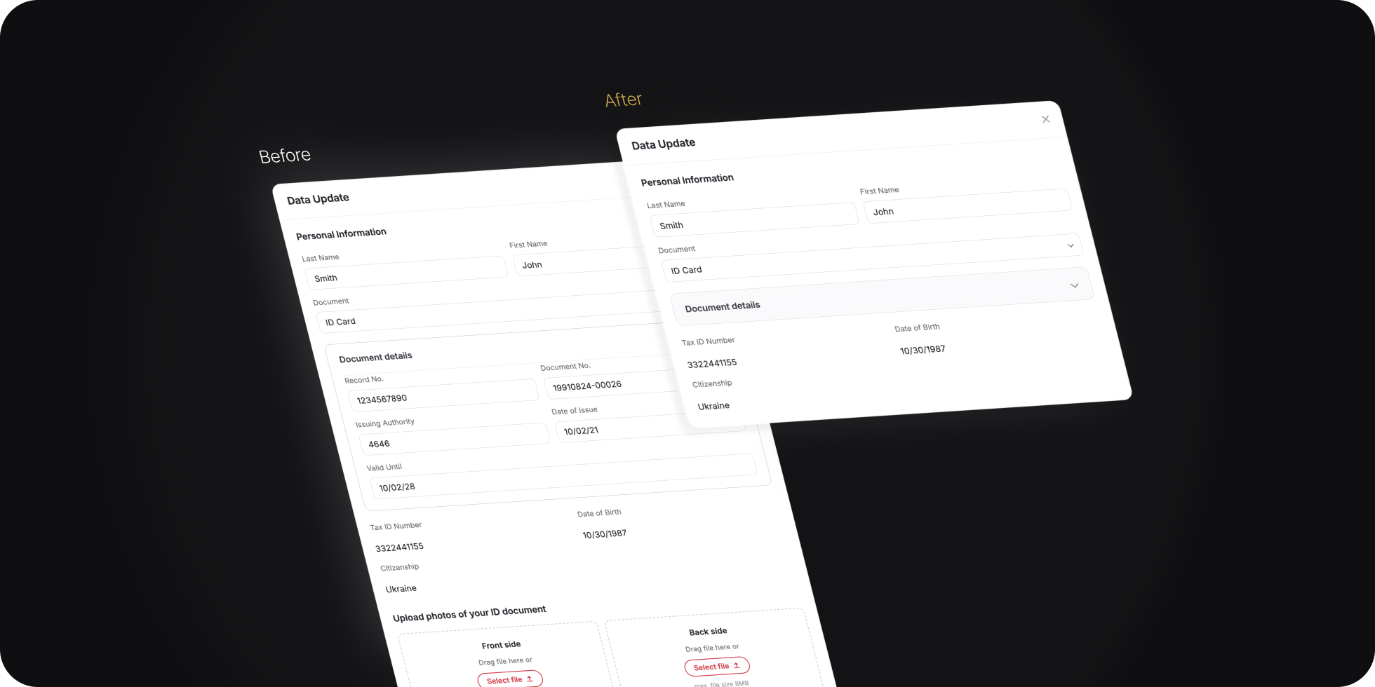
Users were required to periodically update their KYC information. During this process, they were always asked to upload photos of their identity document - even when they hadn't changed it. Support repeatedly reported that customers were abandoning the flow because they were unsure whether they actually needed to upload new documents.
The problem
Support tickets and completion analytics pointed to the same issue: users couldn't understand when a document upload was actually required. The interface displayed the upload section by default, making people assume new scans were mandatory. This created unnecessary friction and caused users to leave the flow before completion.
"Do I really need to re-upload my passport? Nothing changed." - recurring support ticket theme
Discovery
I interviewed support agents, reviewed customer feedback, and analyzed the KYC journey end to end. The key insight was surprisingly simple: most users were not changing their identity document at all. They only needed to confirm existing information - yet the interface forced everyone through the same upload step.
Solution
Instead of always displaying the upload area, I applied the Progressive Disclosure principle. The document upload section remained hidden by default and appeared only when the user changed something that legally requires re-verification - the document type, or their first or last name. This aligned the UI with the user's actual task and removed an unnecessary decision for the majority of users.
I applied the same principle to the document detail fields - record number, document number, issuing authority, and issue / expiry dates. Rather than showing this dense block to everyone, I collapsed it behind a "Document details" accordion that stays closed by default and expands automatically - together with the upload step - only when a change makes re-entering them mandatory. Users can also open it manually at any time if they simply want to review the data. Same goal: keep the default view calm and reduce cognitive load, surfacing information only when it's actually needed.
Formats: PDF, PNG, JPEG, BMP, TIFF.
Formats: PDF, PNG, JPEG, BMP, TIFF.
Formats: PDF, PNG, JPEG, BMP, TIFF.
Formats: PDF, PNG, JPEG, BMP, TIFF.
- Upload section and document details always visible
- Users assumed everything was mandatory to re-enter
- Dense form, high confusion and abandonment
- Upload and document details appear automatically when the document, name or surname changes
- Document details can also be opened manually anytime to review the data
- Unchanged identity → nothing extra to fill in
- Calmer default view, simpler and shorter for most users
Validation
We launched an A/B experiment comparing the original flow with the new Progressive Disclosure approach. We measured KYC completion rate, flow abandonment, and support contacts related to document upload.
Results
What I learned