Web3 · Design Systems · 2022–2023
Design System @DappRadar
From disarray to harmony: a shared system that streamlined development and created a consistent experience across DappRadar products.
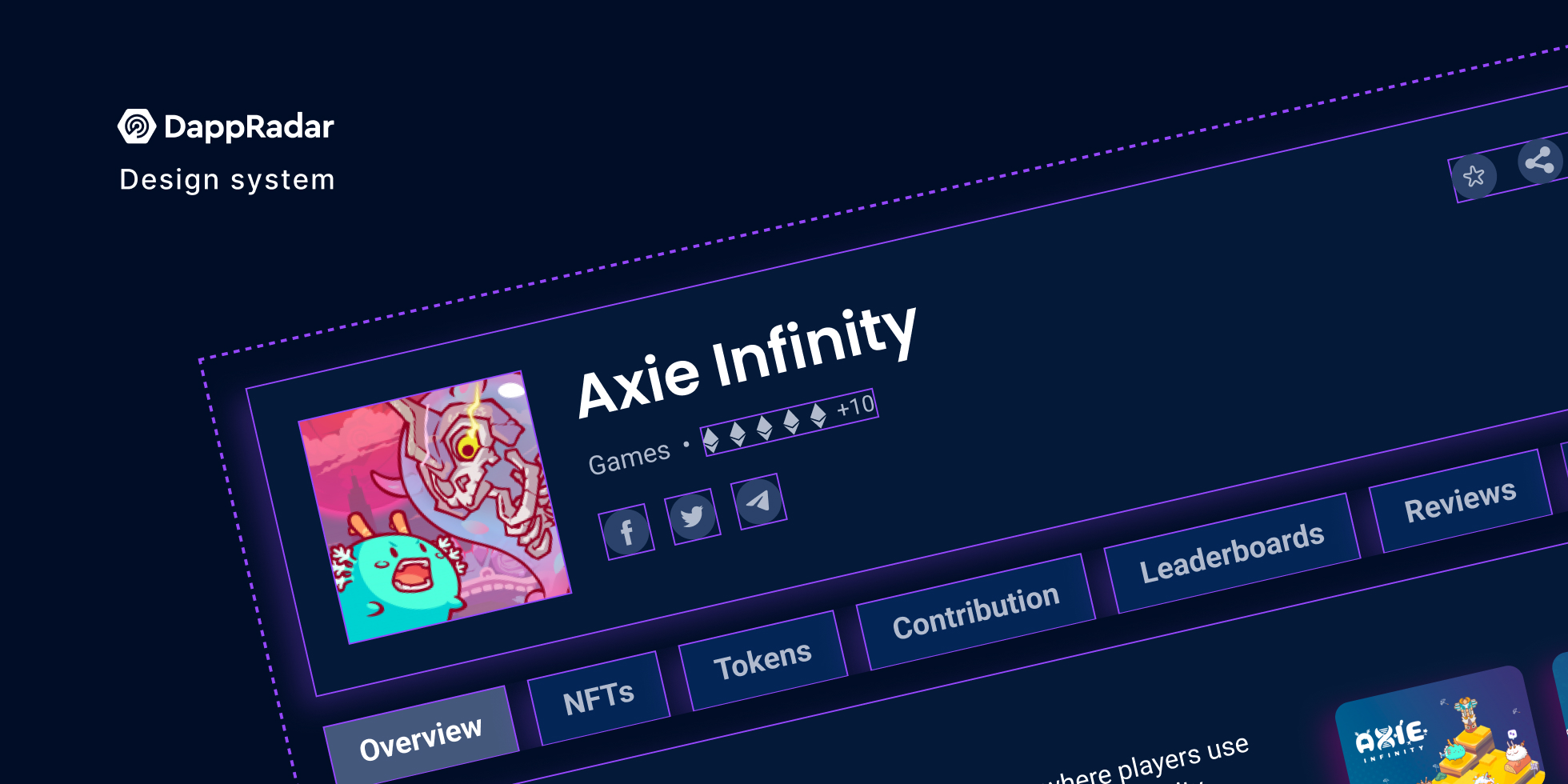
“A shared design language improved consistency, accelerated delivery, and earned a 4.41/5 user rating.”
Overview
DappRadar had grown across multiple Web3 products without a shared design foundation. I led the creation and adoption of a centralized design system spanning Figma, Storybook, and production.
My role
I organized the system architecture, created foundations and components, trained designers, and partnered with engineering to keep implementation synchronized.
The problem
Conflicting colors, grids, patterns, and duplicated components created visual inconsistency, slower handoffs, and recurring design and development work.
The goal
Create one scalable source of truth that strengthened the brand, reduced duplication, and made product delivery faster across every DappRadar vertical.
Starting with a design audit
Before creating the new design system, a foundational design audit was crucial. I gathered all design assets, from UI to colors, into one repository for analysis. I streamlined a myriad of colors into a functional palette, harmonized typography, and assessed the existing grid and spacing systems to identify inconsistencies.
Duplicated components
Disorganized colors
Inconsistent typography
Conflicting guidelines
AuditAnalysis repositoryCollect · compare · prioritize
OutcomeOne shared systemReusable · consistent · scalable
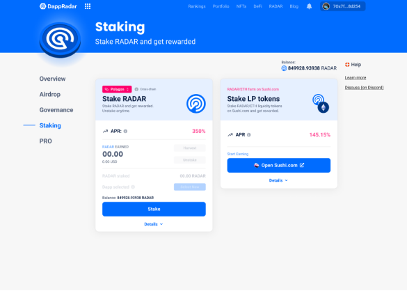
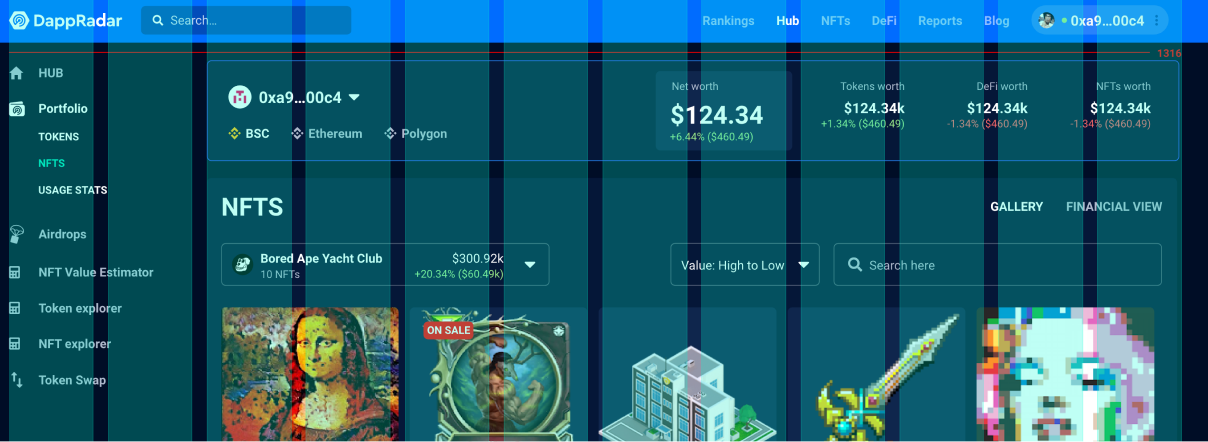
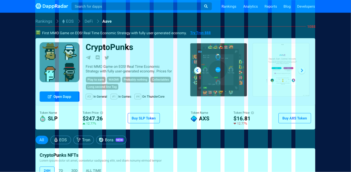
Building the foundations
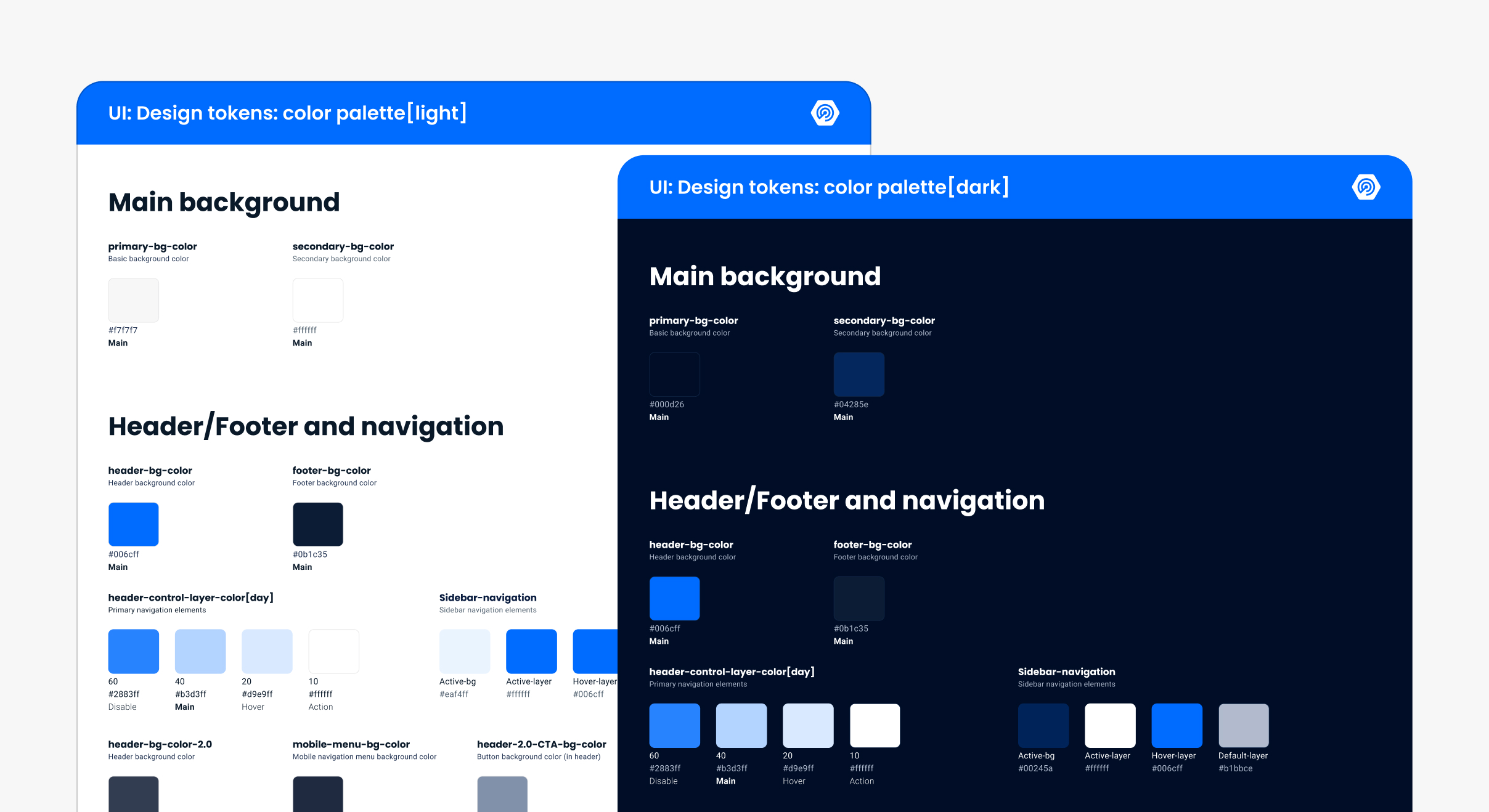
Design tokens: colors
A carefully curated palette standardized the use of color across every interface and strengthened the brand. The tokens were designed for both dark and light themes, creating a flexible framework across different viewing conditions.
Typography system
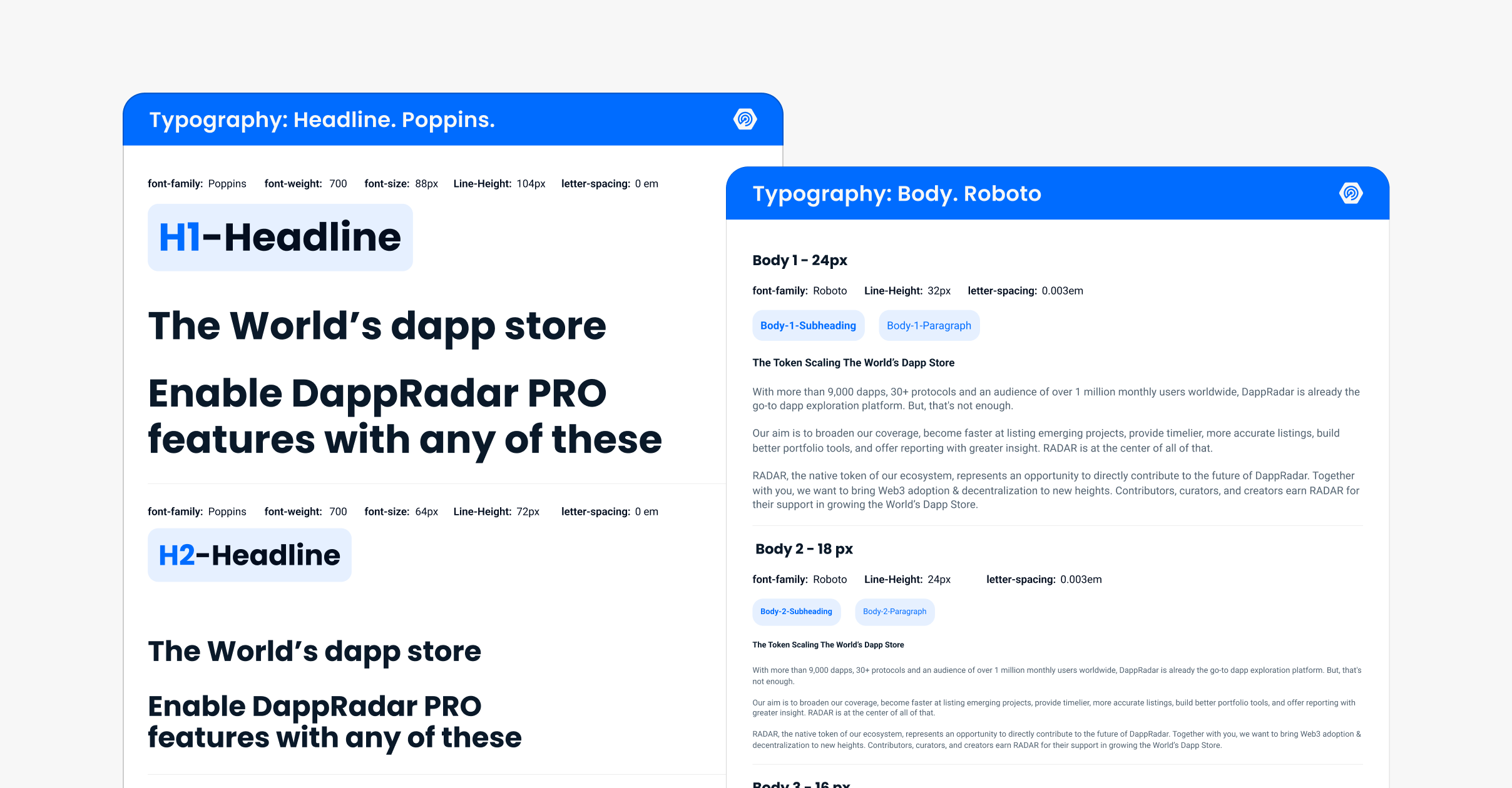
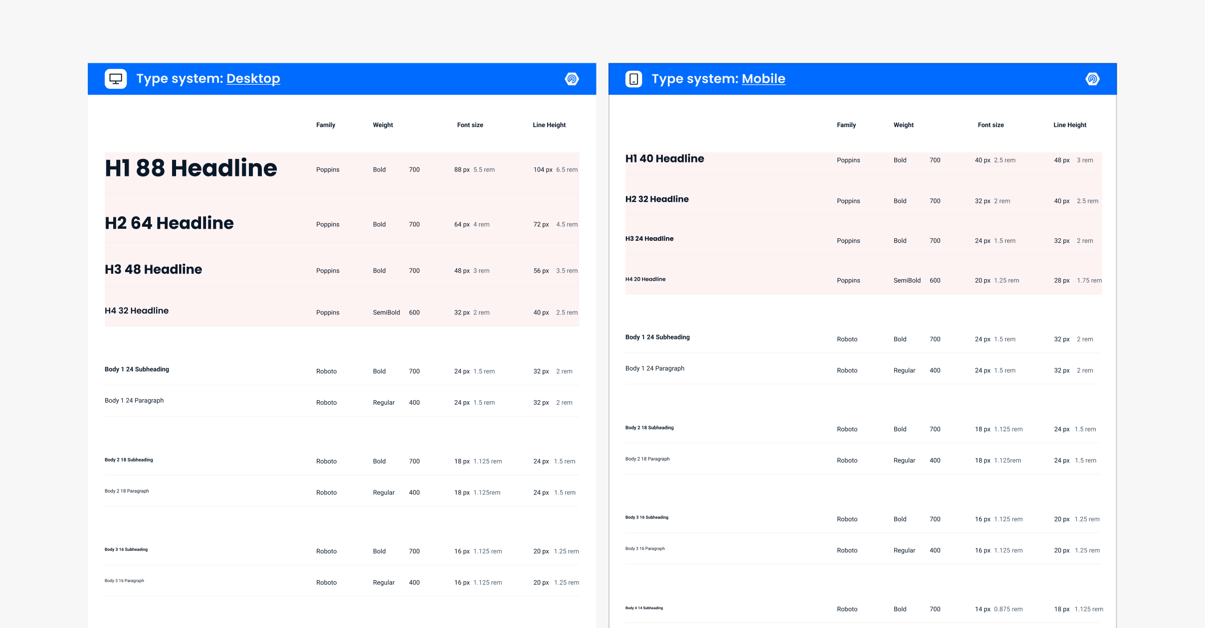
The type system combined Poppins headlines with Roboto body styles and defined consistent size, weight, line-height, and letter-spacing tokens. A specialized mobile scale adjusted sizes and rhythm to improve readability across smaller screens.
A reusable component library
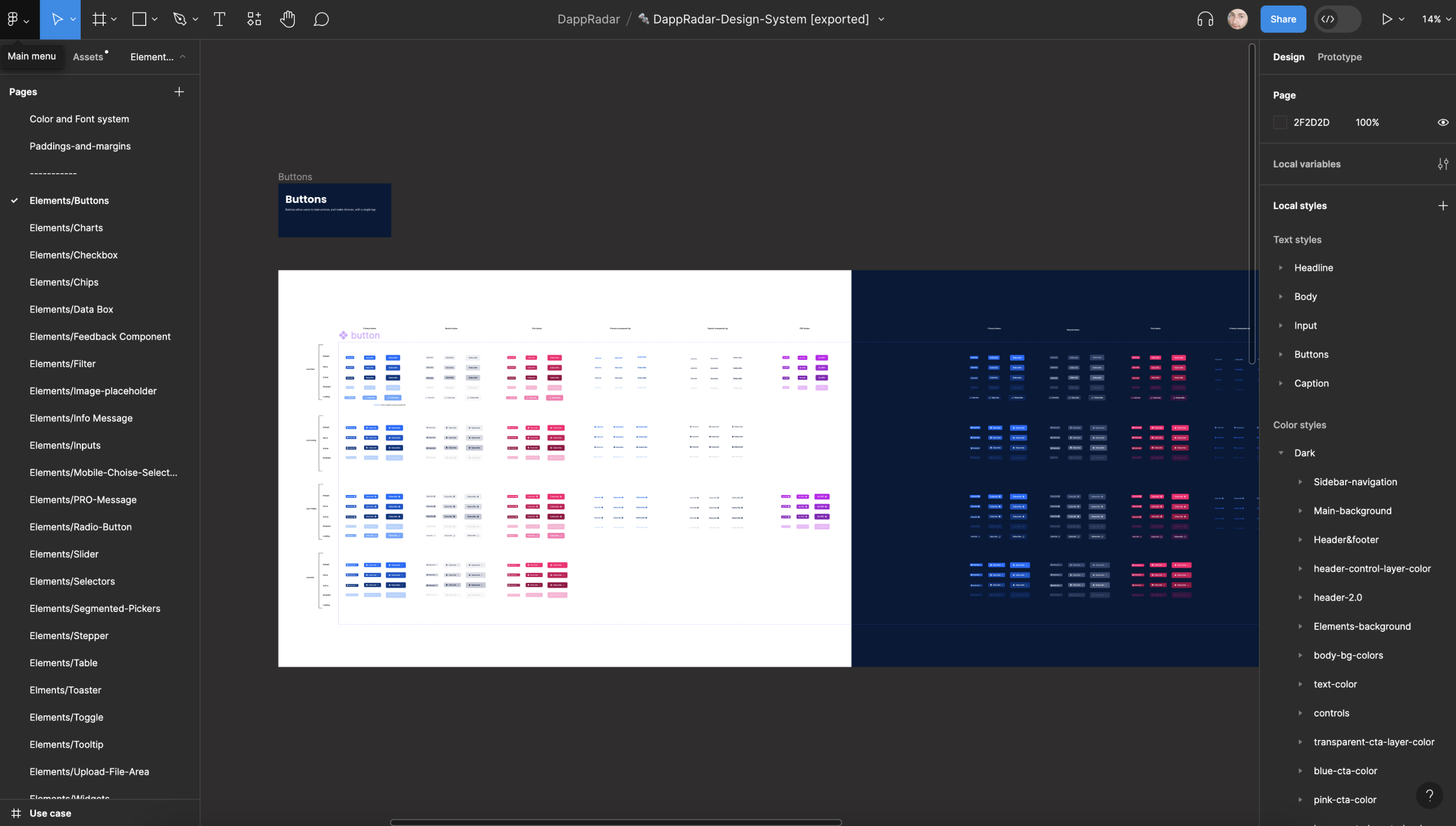
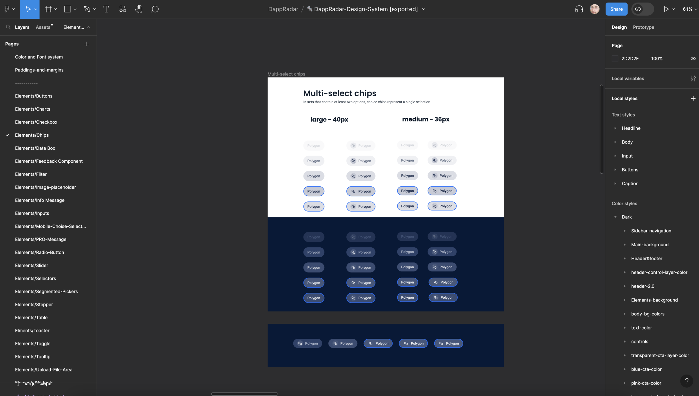
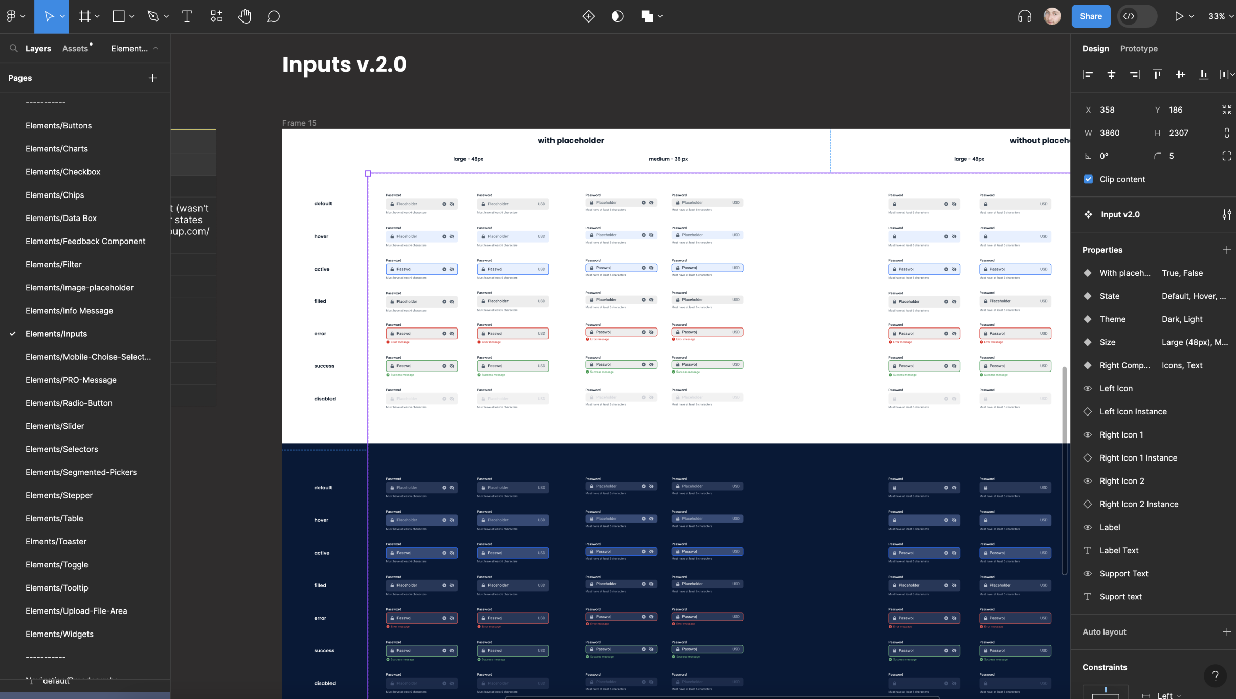
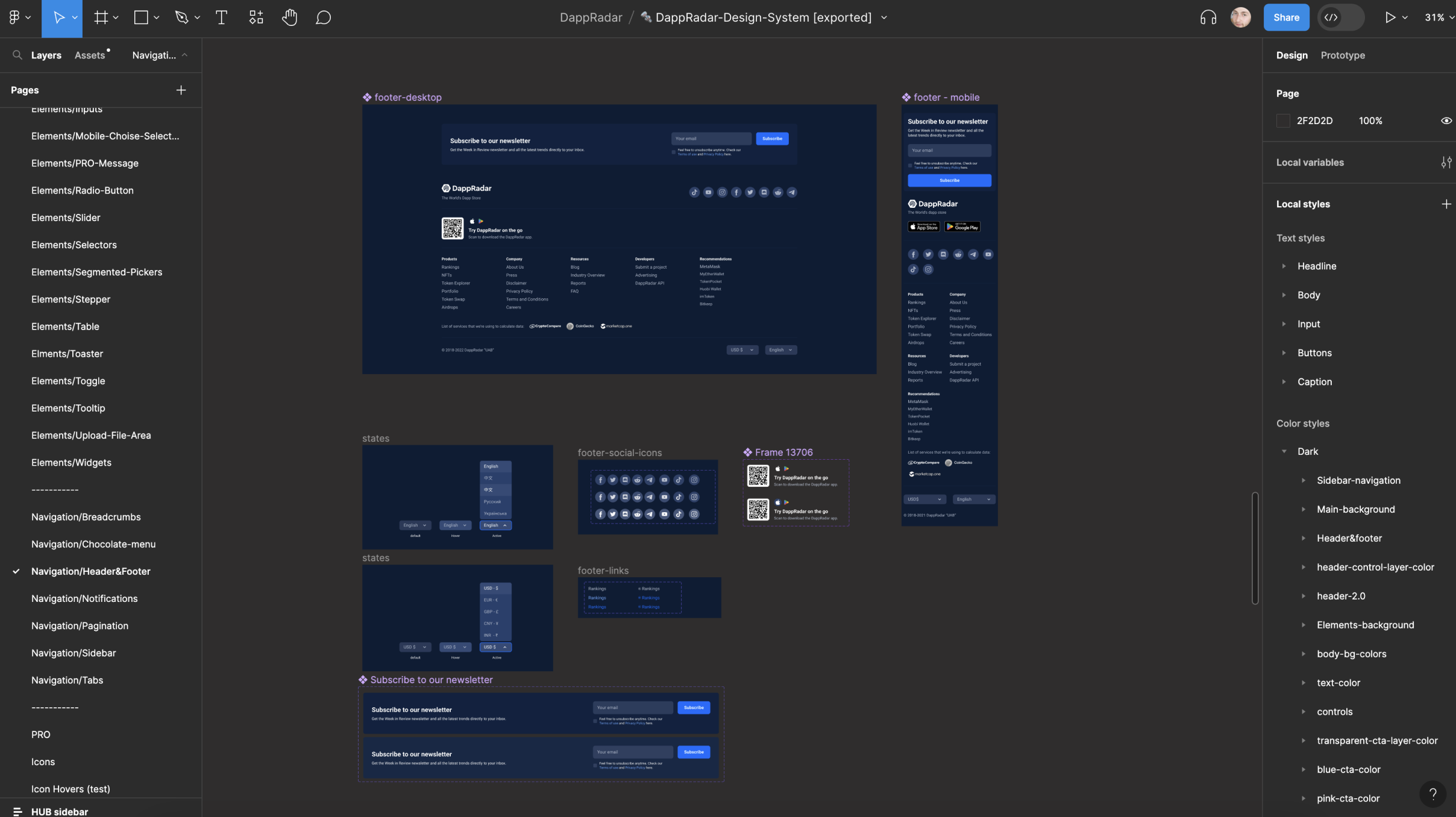
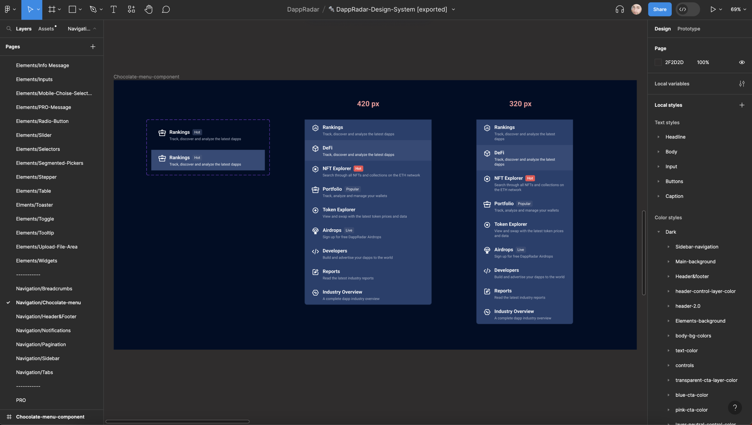
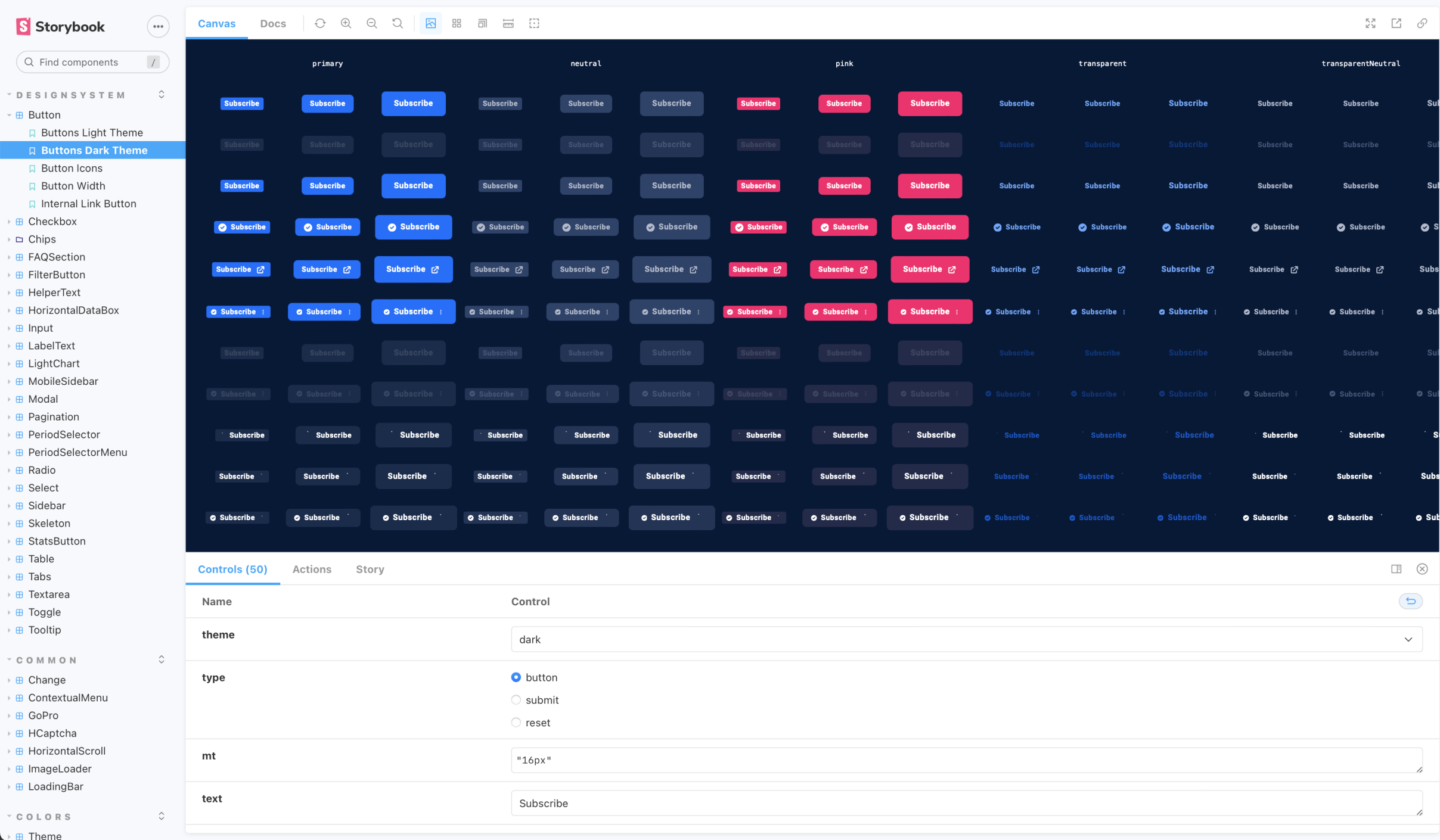
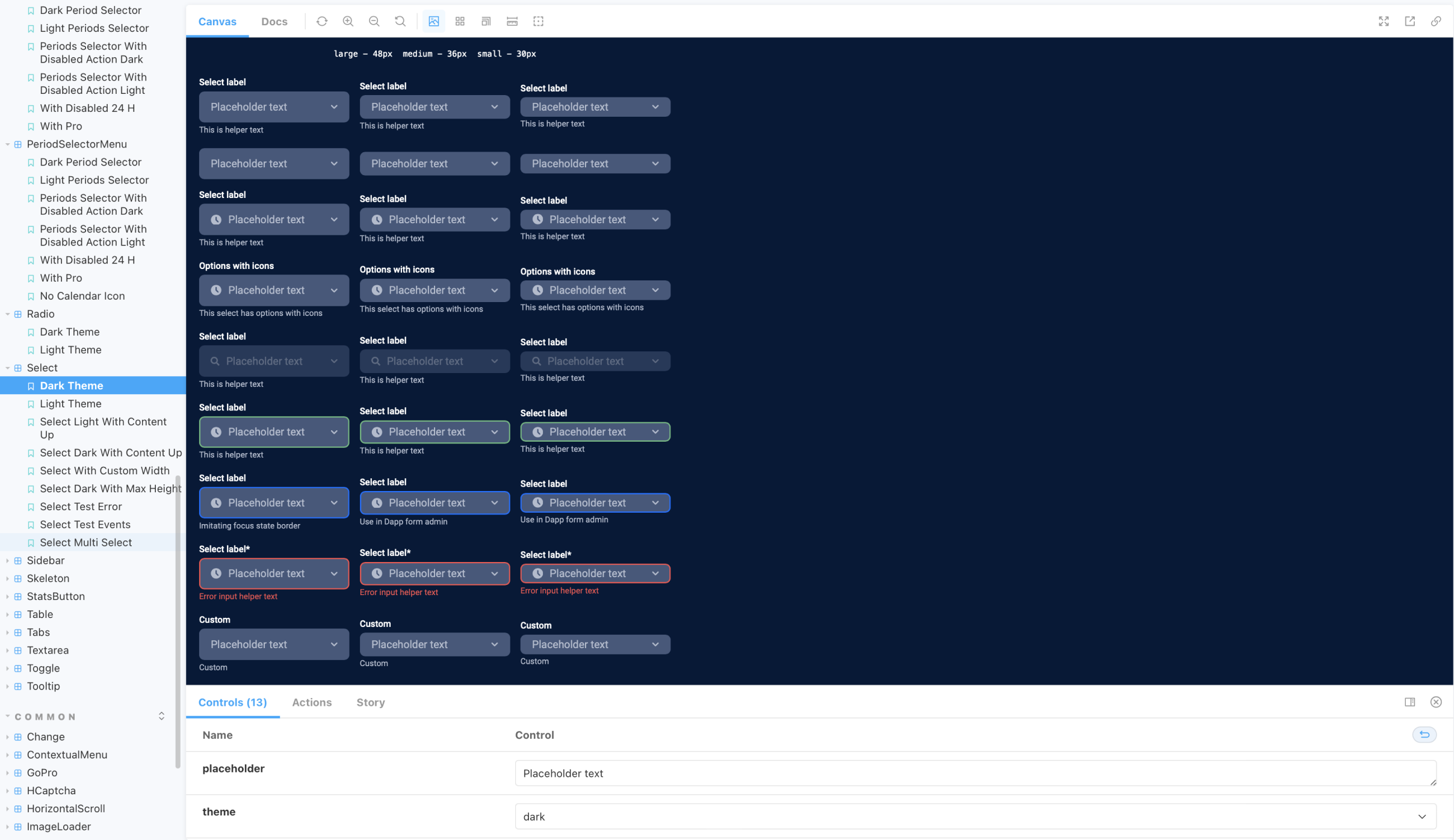
UI components were standardized across interactive states—hover, active, disabled—and multiple sizes. The library covered buttons, inputs, choice selections, checkboxes, chips, data boxes, toasters, toggles, tooltips, upload areas, widgets, breadcrumbs, menus, header, footer, pagination, icons, accordions, tabs, sliders, carousels, modals, badges, progress bars, cards, tables, and lists.
Design and development in sync
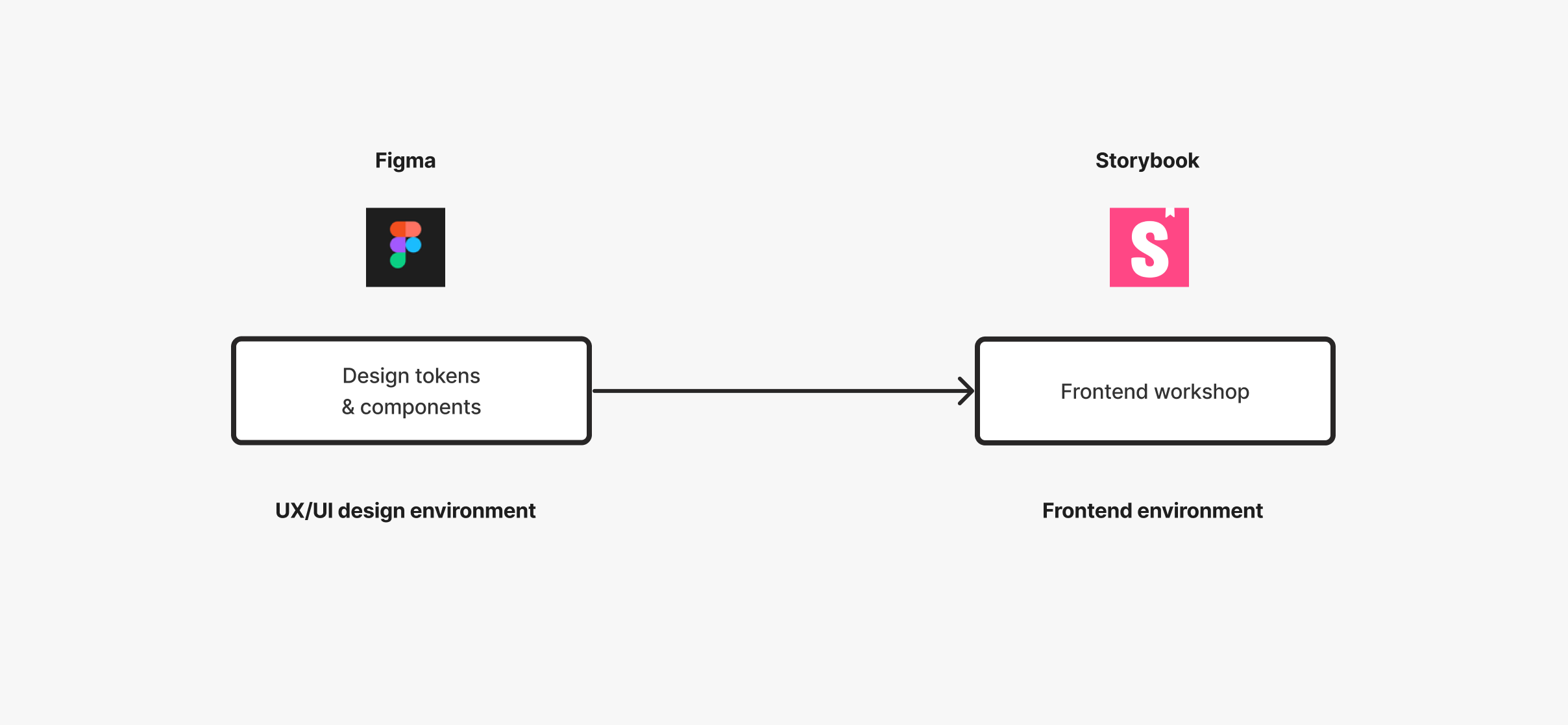
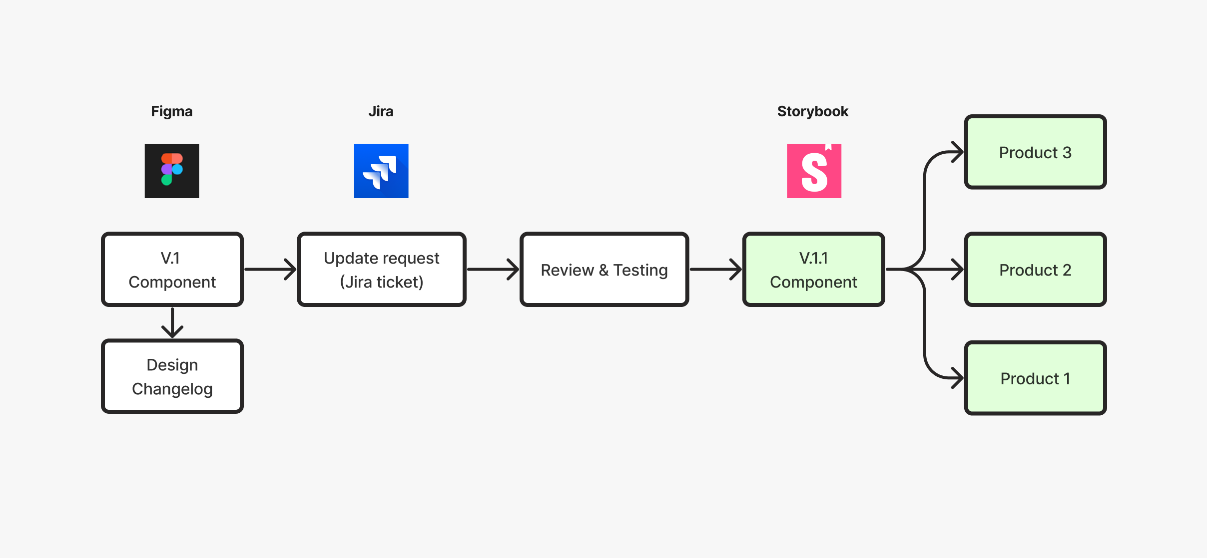
We established seamless synchronization between the Figma design system and Storybook, the frontend development environment. Design updates were mirrored in Storybook, providing a single source of truth, reducing deviations, and enabling real-time collaboration between designers and developers.
Version control
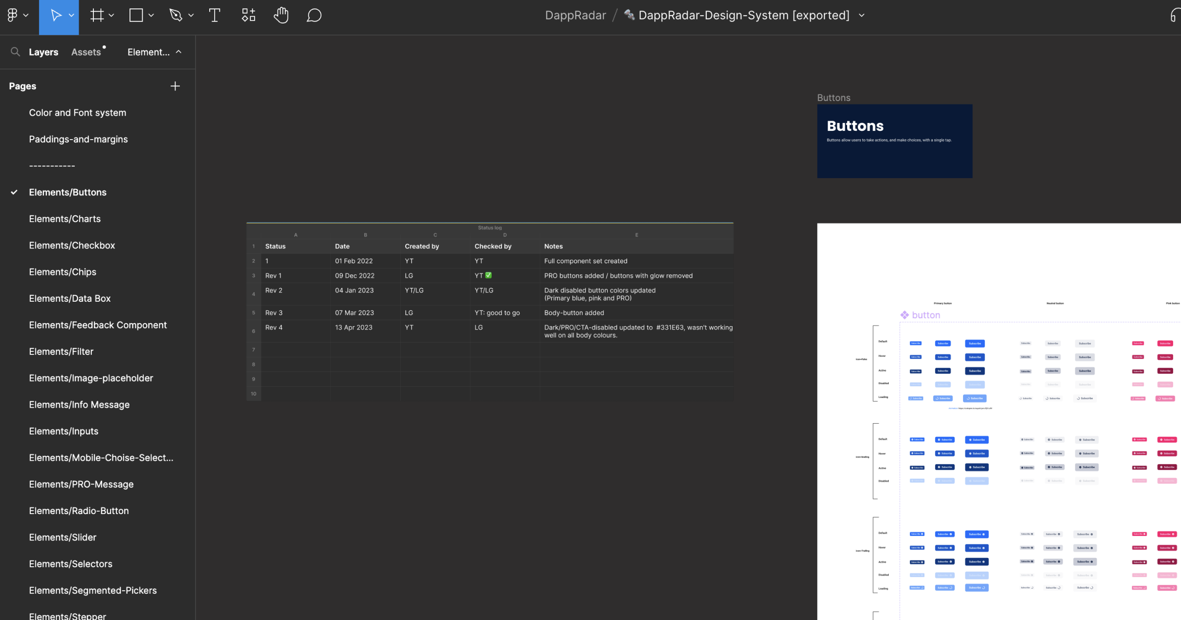
After the system was reflected in Storybook, each component was assigned version 1.0. Designers logged modifications in a Figma changelog for peer review. Every update also received a Jira ticket documenting the new version and required changes before passing through design review and quality control.
Accessibility built in
Accessibility testing was an indispensable part of the system. A Figma plugin checked the contrast ratio of visible text and provided immediate feedback on whether designs met WCAG AA and AAA compliance levels.
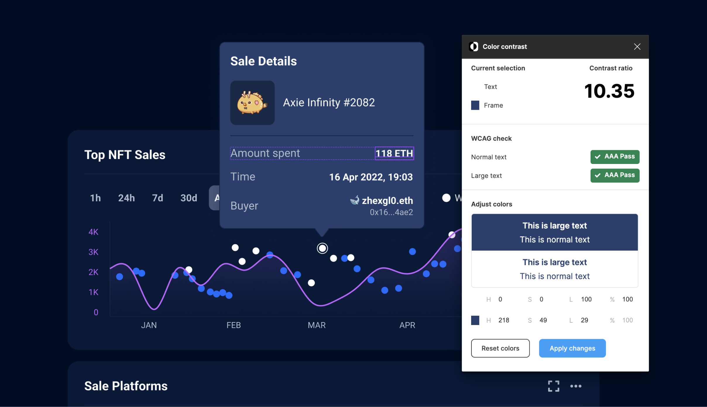
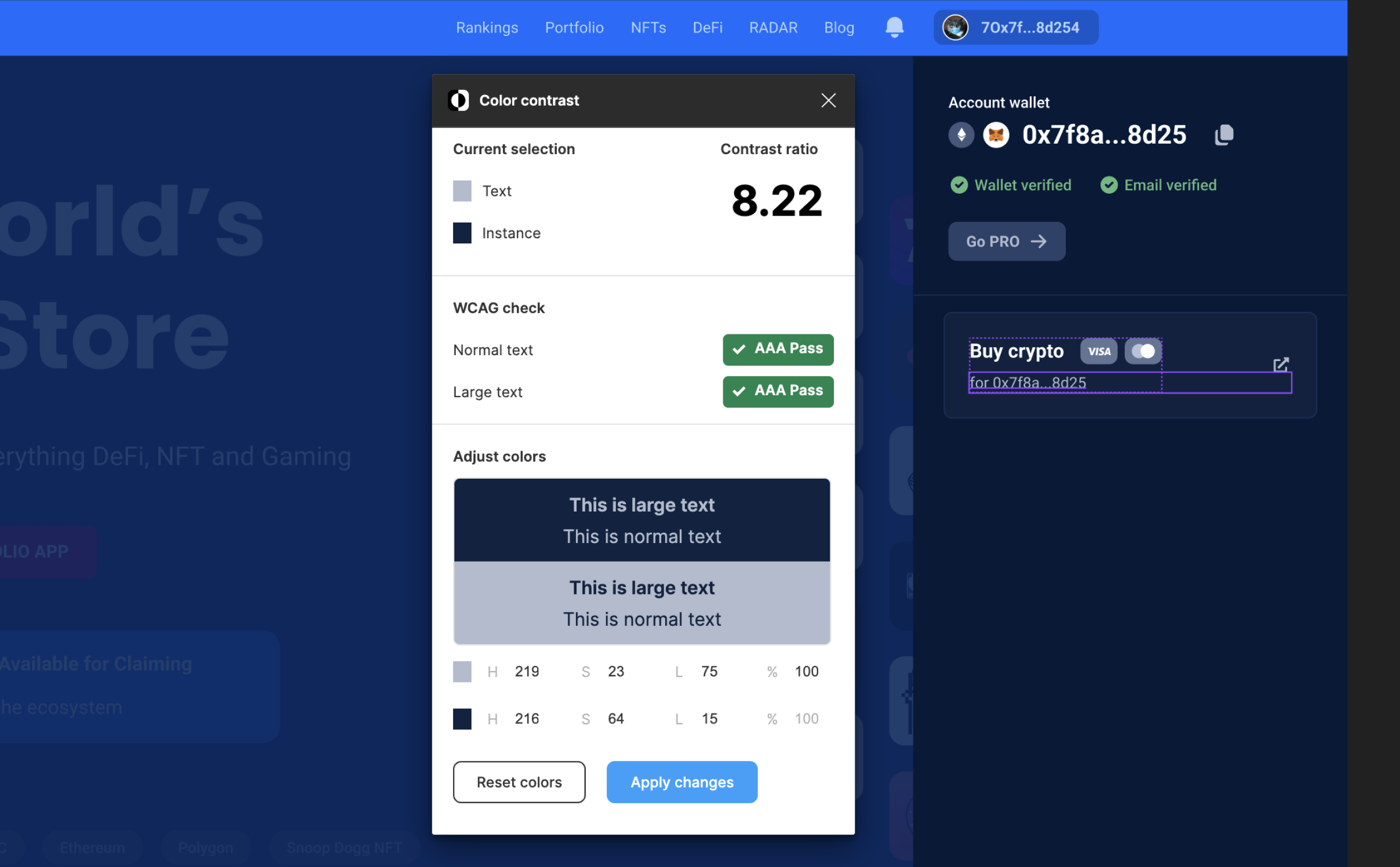
Beyond contrast, typography was selected and tested for legibility across devices and user settings. Interactive elements—including buttons, forms, and links—were designed for keyboard navigation and screen-reader compatibility.
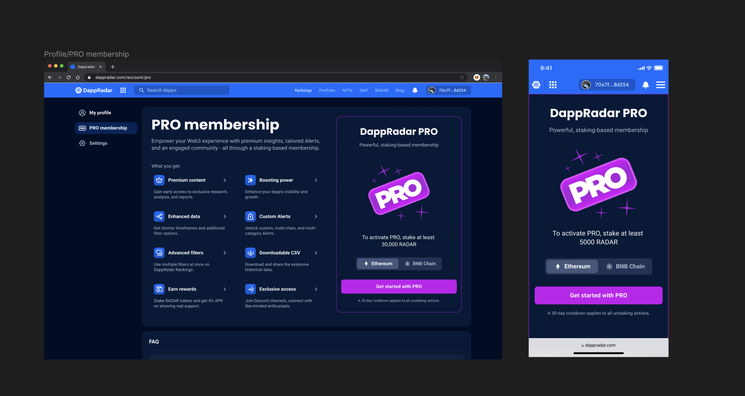
Validation in the product
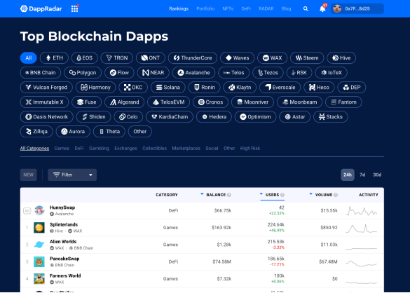
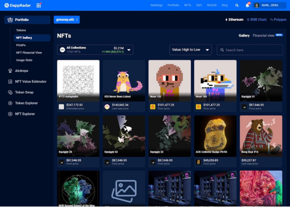
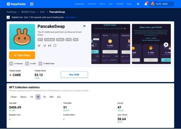
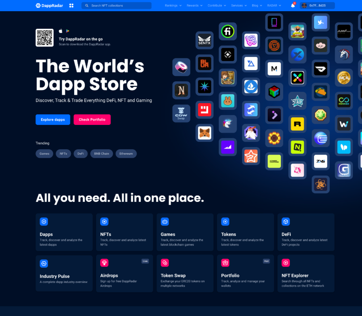
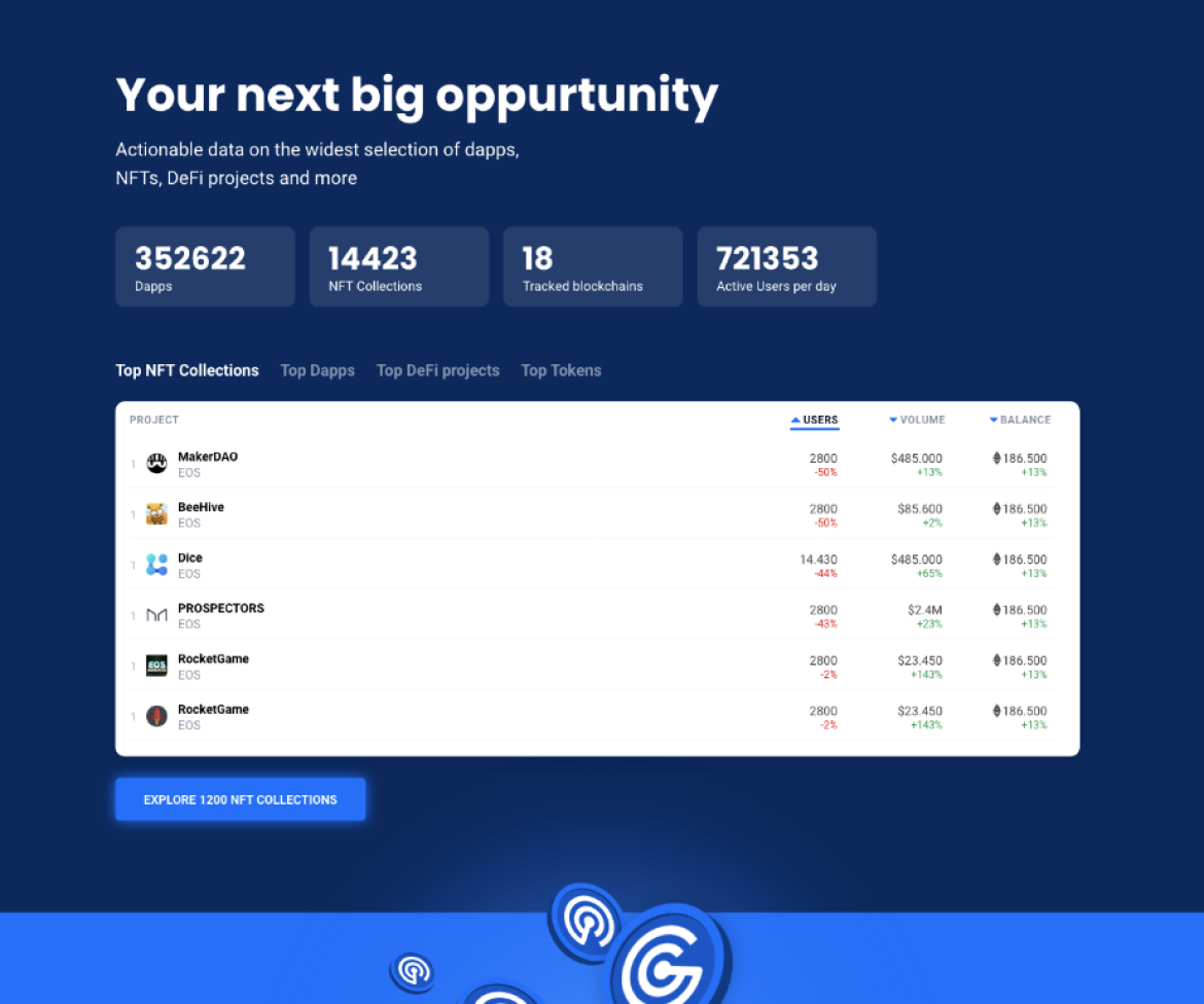
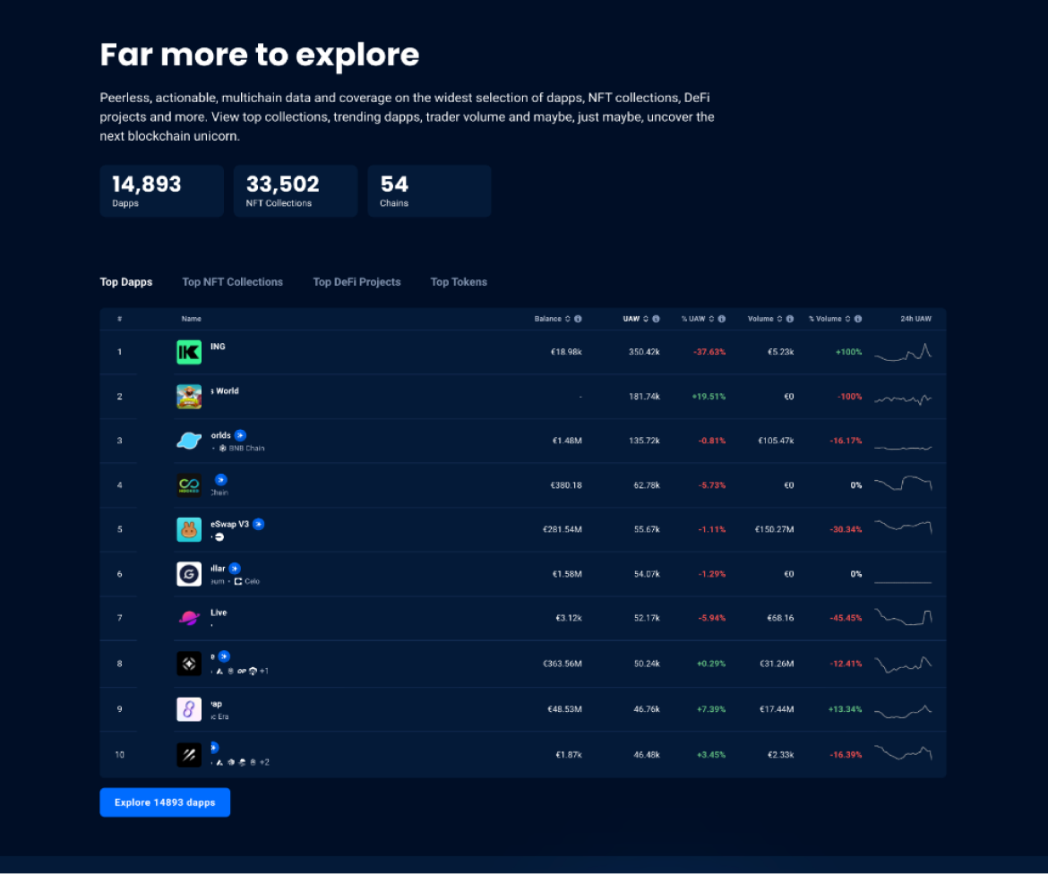
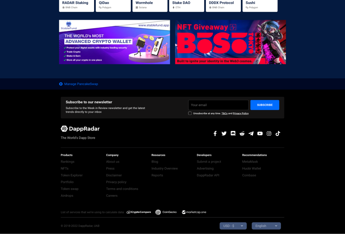
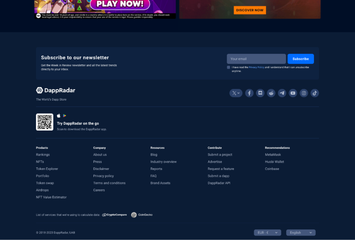
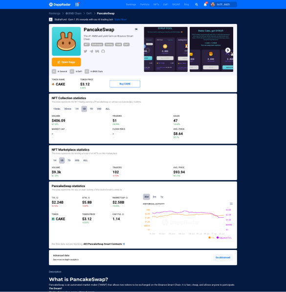
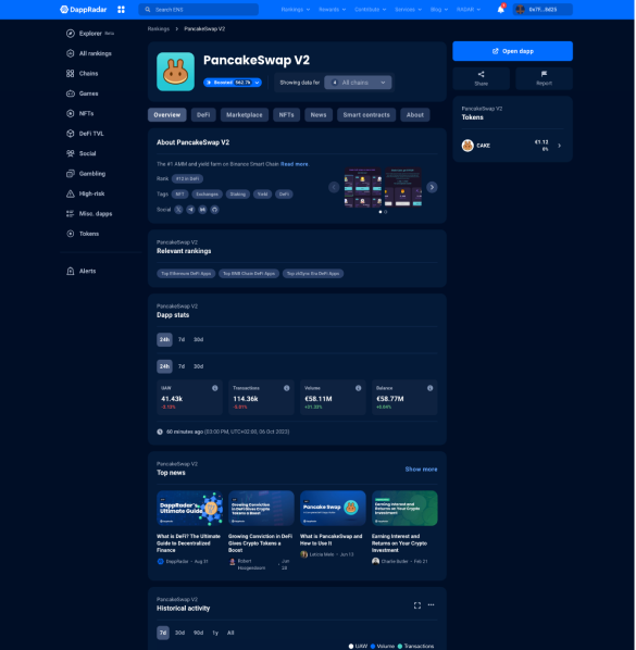
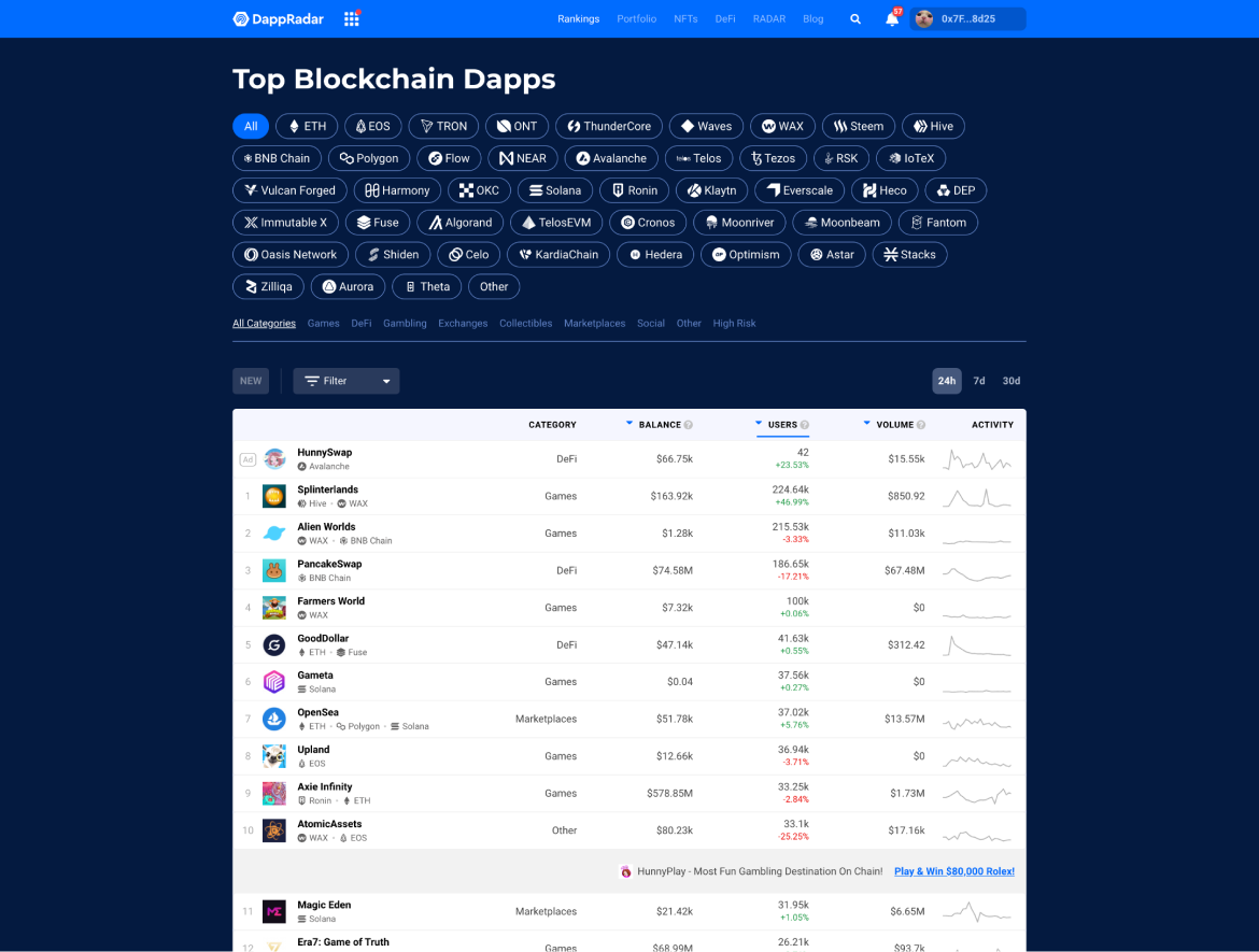
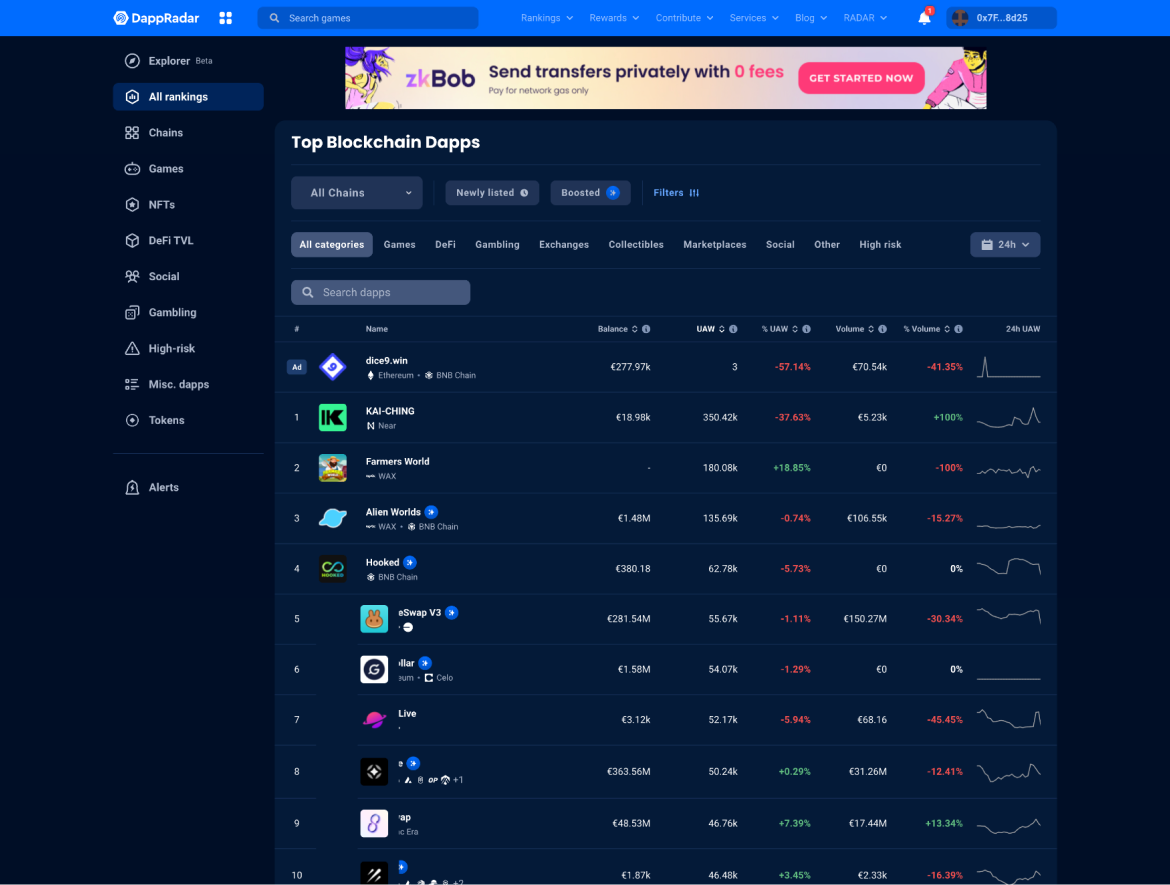
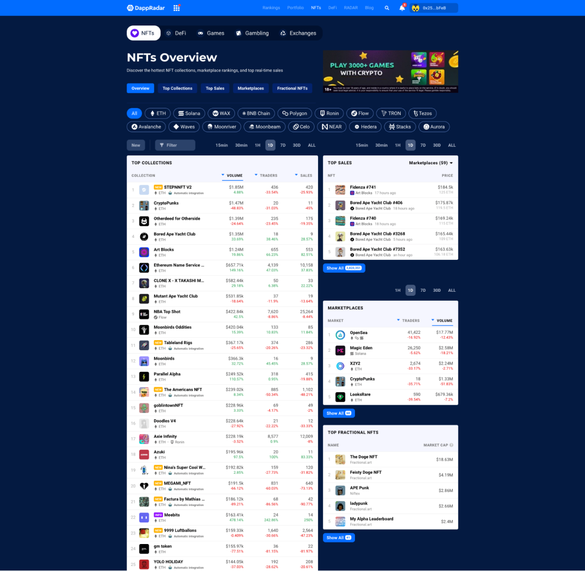
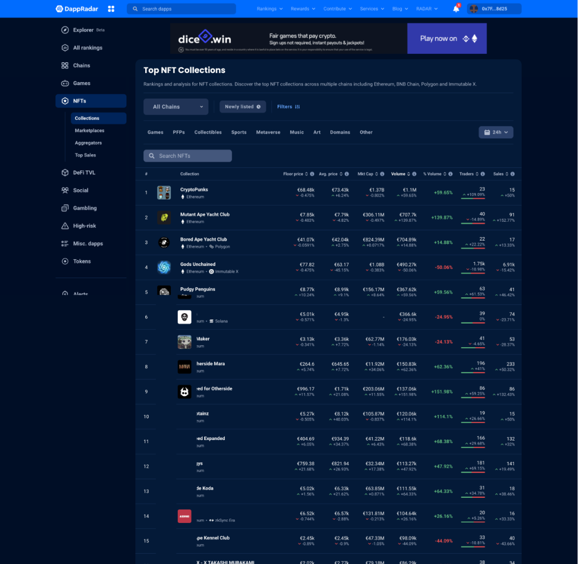
Before-and-after comparisons showed how the shared foundations improved navigation, page structure, content hierarchy, and product surfaces across the DappRadar ecosystem.
Home page hero
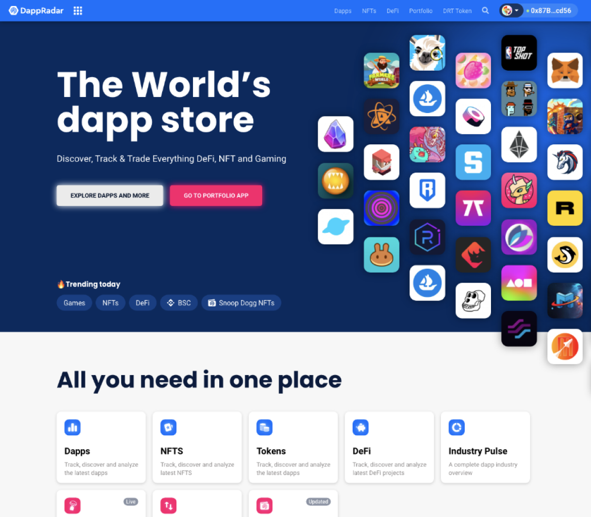
Home page section
Footer
Single project page
Rankings page
Top NFTs page
User testing and feedback
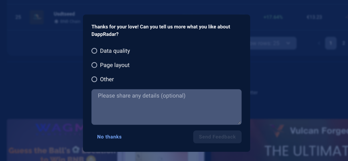
First, an internal feedback widget provided real-time qualitative insights. Users frequently commended the improved consistency and ease of navigation, indicating a more seamless experience.
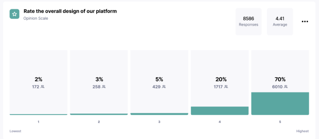
Next, a comprehensive survey measured satisfaction after implementation. Of 8,586 responses, 70% gave a five-star rating and another 20% gave four stars, producing an average score of 4.41 out of 5.
Internal feedback
Informal interviews, team discussions, and internal communication reviews showed smoother designer–developer collaboration, faster decisions, and more efficient product cycles.
“Early in his journey at DappRadar, Yevhen took the lead in transitioning us to Figma and setting up a design system. This change notably improved our workflow speed and the consistency of our products.”
Dragos Dunica · Co-Founder at DappRadar

“Yevhen developed an innovative design system and skilfully presented and onboarded the entire team. Thanks to his efforts, collaboration between designers and developers has been enhanced, boosting efficiency across the organization.”
Justas Samalius · Head of Design at DappRadar

“The design system streamlined our workflow by providing standardized components and guidelines. This led to quicker handoffs, more efficient tracking through version control, and accelerated release cycles.”
Giedrius Vičkus · Lead Frontend Engineer

Results
4.41Average user rating out of 5 after implementation
70%Of respondents awarded the experience five stars
8,586Responses captured in the user survey
1.0Versioned component baseline shared across Figma and Storybook
Product-cycle efficiency: the team reported a significant improvement in the time from ideation to deployment.
Internal collaboration: standardized components and clear guidelines improved cohesion across departments.
Visual and brand consistency: the system established a recognizable experience across the DappRadar ecosystem.
User satisfaction: 8,586 survey responses produced a 4.41/5 average, with 90% rating the experience four or five stars.
Scalability: semantic tokens and layered colors created infrastructure that could expand to new products, interfaces, and themes.
Version control: the Figma changelog, Storybook, peer review, and Jira workflow made component changes traceable and dependable.
Next project
Rankings Experience @DappRadar